Introduction
What is the essential story being told by your portfolio site? Describe the version of you that it is about.
In 2034, ghosts are an epidemic haunting homes and businesses. Systems have been put into place to identify and expunge these otherworldly presences. Ghost Identification Specialists are a required first-step in requesting a licensed and insured ghost remediation.
Nancy Ghoul is a Ghost Identification Specialist, licensed thru Ghost Investigators and Graveyard Scouts (GIGS). Their main line of work is to identify ghosts and gather evidence in hauntings, passing their findings off to a GIGS cleanup team.
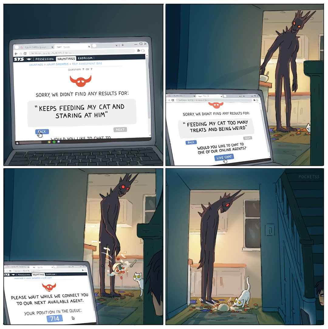
This future has largely been inspired by the series Lockwood & Co., the video game Phasmaphobia, and this comic by artist _pocketss. All ghost types and mechanics described on the site are direct references to their Phasmophobia game versions.
What is the audience you are addressing? What type of structure did you choose to implement?
Vistors to the site want help with their ghost-related problems. They are looking for quick, reliable, and GIGS-certified assistance to resolve their hauntings.
To assure the visitor on Nancy Ghoul's reliablity, links to accreditation and affidavits are avalible on the 'About' page. GIGS mandated reports serve as Nancy Ghoul's portfolio of successfully solved cases. Nancy Ghoul also writes blog articles relevant to their work, and has also provided a Quick ID page to help them triage potential cases.
The website has a traditional, hierarchical structure. The main navigation in the header provides access to top-level pages, such as the case reports and blog. Access to the subpages (individual case reports or blog posts) is avalible through their respective parent.
Inspiration
State 3 professional portfolio sites (not advices articles or portfolio templates) that have inspired you when creating your website. What did you learn from them?
-
Lynn Fisher
lynnandtonic.com
I am a long-time fan of Lynn Fisher, and frequently reference her project 'A Single Div'. Fisher updates her portfolio about once a year; the site is, in itself, a showcase of her CSS ability.
Main Nav
Home
Be sure to resize your browser
Work
Gallery of work and projects
About
Self described, includes links to interviews and published talks
Thoughts
Blog posts in decending post order
Archive
Previous iterations of the site
Dark/Light Mode Toggle
Footer Nav
Email
Shop
Gifs
RSS Feed
Blog
Twitter Archive
Mastodon
GitHub
Codepen
-
Joshua Comeau
joshwcomeau.com
Josh Comeau is a great developer, and I use his CSS reset almost exlusively. His personal portfolio site is a bit of an outlier, as it focuses mainly on his tutorials and articles with very little about himself (although some of his content does focus on himself and his personal experiences).
Main Nav
Home
Latest
Blog posts in decending post order
Posts
Blog posts in categories
Goodies
Helpers like snippets, gradient generator, and shadow generator
Courses
An overview of the courses Comeau has published
Dark/Light Mode Toggle
Disable Sounds
RSS Feed
Footer Nav
Copyright
Tutorials
A list of Comeau's most common tutorial categories: React, CSS, Javascript, etc.
Links
Legal links relevant to Comeau's tutorial site and his Twitter
-
Dave Rupert
daverupert.com
I am familiar with Dave Rupert thru the podcast Shoptalk, and his contributions to the A11Y project.
Main Nav
Home
Gallery of work and projects
About
Self described, includes links to interviews and published work, likes and gear, and support
Archives
Blog posts with filtering via tags
Bookshelf
What Rupert's been reading
Projects
Gallery of work and projects
Stories
Rupert's short scifi
RSS Feed
Footer Nav
Copyright
Mastodon
Twitter
GitHub
Takeaways
-
AllAbout MeThe 'About' sections were less of a CV, and more of an overview of interests and published work (or talks). Comeau forwent an 'About' section entirely.
-
Blogs
Everyone is blogging. Each site includes a RSS feed, and there's a good number of posts on each site within the past year. Subject matter is a mixture of professional and personal interest.
-
Cool tidbits
Each author's personality is showcased on their site. There are cute additions like Comeau's avatar popping out from the side of the webpage as the user scrolls down. Rupert has a 'Star Wars crawl' inspired landing page, and has included his current reading list in the topline navigation. Fisher's entire site is just cool CSS. She also has a shop for her designs, and a page specifically for CSS gifs she's created.
-
Contact
The days of contact forms are over. All references to contact the author are either a
mailtolink or the author's social media. Rupert has not included his email.
I am definitely straying a bit from a developer's website with my chosen persona. Because of the nature of my fantastical subject matter, I aim to incorporate these findings but also focus on the report's prompt of 'What is the audience you are addressing?'
While most of the inspiration sites were light on their 'About' pages, Nancy Ghoul will need a more robust 'About' page to reassure their potential clientele that they are capable and qualified. This will include their GIGS certification number and accreditations.
I will be implementing blog posts, as a site visitor might be interested in reading about ghosts, hauntings, and other related topics. In addition, in this universe GIGS certified hunters are required to write and publish case reports for each ghost identified. These cases will be published on Nancy Ghoul's site.
For a fun addition, visitors might want to quickly diagnose their hauntings. A 'Quick ID' checklist will be avalible for site visitors to hopefully gather more information about their haunting. In-universe, this also helps with triaging the haunting.
Accessibility
State 3 ways in which your site is accessible.
- I've focused on keeping a clean HTML structure, minimising divs and having a hierarchical structure that makes sense for screen-readers. For example, blog previews include an image. Visually, I'd want to display this image before the blog title, but semantically it makes more sense for it to be below. I've used flex ordering to achieve both needs.
- All images also include descriptive alt text, as well as attributions. While I personally feel this is a minimum to achieve an accessible website, this is often overlooked.
-
I have also exclusively used native HTML elements, rather than creating buttons or checkboxes from
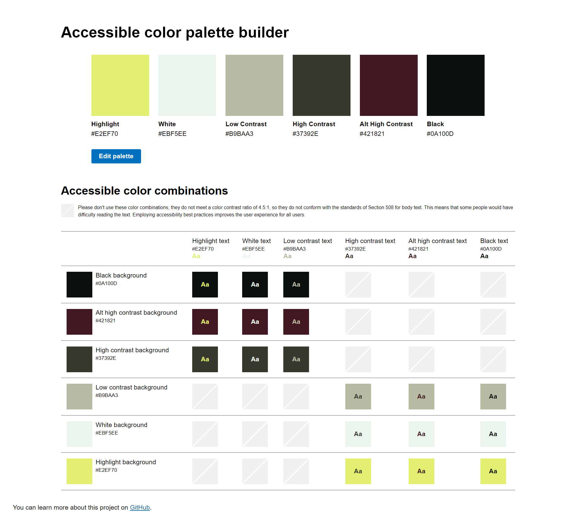
divtags. Using native HTML elements means the site takes advantage of built-in ARIA functionality. This removes the need to explicitly add aria-attributes, such asaria-checkedon custom checkboxes. I've lightly styled the native elements using CSSaccent-colorto better intergrate them into the theme of the website. - Consideration has also been made when selecting the colours of the site. All text and background combinations have been tested to ensure a contrast ratio of 4.5:1 or higher. A matrix of combinations is avalible in the Appendix.
Usability
State 3 ways in which you considered the usability of your site.
-
I've considered the target audience's main goals will be to contact Nancy Ghoul, validate Nancy Ghoul's accreditation and competence, and find solace in other cases that were resolved. All of these motivators will be addressed via top level navigation for ease of access.
-
In looking at Comeau's site, I found the HTML structure of his blog posts fantastic. Each post title is a h1 tag, each article has a table of contents in an aside, each subheader has an anchor. I am directly referencing his layout when designing my own. This structure gives a clear overview to the contents of the article, and helps readers quickly navigate to content that is the most relevant to them.
- Another addition to improve the usability of the site are the filters avalible on case reports and blog posts. Visitors will likely be searching for information about specific ghost types. These filters allow quick selection of content relevant to the user's needs.
Learning
State 3 things you had to learn or find out to create your site. How did you achieve that?
-
There were several components where I wanted to guarantee that the HTML was both the most semantically correct and accessible. Quotations and testimonials, for example, are not components that I've used frequently. My go-to for most component compositions is CSS Tricks, and this article by John Rhea provided good insight into best practice.
-
I have also not previously implemented a native dialog element, and was interested in testing the methods avalible via pure HTML and CSS. However, it is unfortunately not possible to have a working dialog without some Javascript to handle opening and closing of the modal. It took a few articles and tutorials to implement what I wanted to achieve.
- While I've already mentioned the structure of the blog posts on Comeau's site, it was a geninuely fun learning moment to discover the structure. I feel it's rare to find something so well crafted with accessible HTML structure in mind. I haven't created a blog, so seeing Comeau's implementation was a great inspiration.
Evaluation I
What aspects of your work do you think were particularly successful? Why?
I am fairly pleased with the design of the site. It's taken on a very minimalist, almost brutalist, interpretation of an old Nancy Drew book. This allows the focus to be on the content, which fits for the brief. It also lends itself to an almost government-like identity, which fits with the in-universe premise of ghost hunting being a regulated service industry.
Writing the inclusive/exclusive filter for the blogs, case reports, and quick ID was also fun. While the requirements were deceptively simple, testing each state revealed that the script needed to be more advanced than originally anticipated. The final implementation works correctly, and is able to handle both the inclusive and exlusive behaviour needed for all use-cases.
Evaluation II
What aspects of your work could be improved? How might you do things differently another time?
As mentioned, I struggled with implementing the Javascript for the dialog component. Despite referencing the documentation for the methods avalible on the dialog, I couldn't get the example to work in my implementation. Something seemed to be missing a type, as the error usually came back with .close is not a function. I ended up following the example shown in the CSS Tricks article here. This will be something I continue to look into independently.
Another improvement I would like to make is adding an 'empty' state for the filtering components. As it is now, if a user selects a combination of filters and no results match, nothing shows. Ideally there should be a message encouraging changing the selected filters. I had tried to implement this, but couldn't find a reliable, accessible way to do so. Adding elements to the DOM tend to 'lag' behind by one state change. Another attempted solution of 'hiding' a message behind the content didn't end up being accessible to screen readers; it was either always present, or did not have the 'screen-reader' tag removed in time for it to be true.
Resources
What resources did you use in your work? List any sources of information, libraries, plugins, code or tools (you should also indicate inclusions from other sources within your code using comments)
- Accessible color palette builder, 2017. [Online]. Available:https://toolness.github.io/accessible-color-matrix/. [Accessed: August 19th, 2024].
- ARIA Authoring Practices Guide, 'Patterns', 2024. [Online]. Available:https://www.w3.org/WAI/ARIA/apg/patterns/. [Accessed: August 20th, 2024].
- ARIA Authoring Practices Guide, 'No ARIA is better than Bad ARIA', 2024. [Online]. Available:https://www.w3.org/WAI/ARIA/apg/practices/read-me-first/. [Accessed: August 20th, 2024].
- C. Coyier, 'Some Hands-On with the HTML Dialog Element', 2019. [Online]. Available:https://www.w3.org/WAI/ARIA/apg/practices/read-me-first/. [Accessed: August 30th, 2024].
- ChatGPT, 'Phasmophobia Game Overview', 2024. [Online]. Available:https://chatgpt.com/. [Accessed: August 29th, 2024 at 13:58].
- J. Rhea, 'Quoting in HTML: Quotations, Citations, and Blockquotes', 2019. [Online]. Available:https://css-tricks.com/quoting-in-html-quotations-citations-and-blockquotes/. [Accessed: August 30th, 2024].
- Kinetic Games, 'Phasmophobia', 2024. [Online]. Available:https://www.kineticgames.co.uk/phasmophobia. [Accessed: September 8th, 2024].
- MDN Web Docs, 'HTML: HyperText Markup Language', 1998–2024. [Online]. Available:https://developer.mozilla.org/en-US/docs/Web/HTML. [Accessed: August 20th, 2024].
- MDN Web Docs, 'Javascript', 1998–2024. [Online]. Available:https://developer.mozilla.org/en-US/docs/Web/JavaScript. [Accessed: August 20th, 2024].
- MDN Web Docs, 'Javascript', 1998–2024. [Online]. Available:https://developer.mozilla.org/en-US/docs/Web/JavaScript. [Accessed: August 20th, 2024].
- Unsplash. [Online]. Available:https://unsplash.com/. [Accessed: August 20th, 2024].
I had ChatGPT generate the blog post on . The prompt was as follows: Write a blog post about a Phasmophobia Wraith
Ghost evidence and descriptions are inspired by Kinetic Games' Phasmophobia.
Appendices
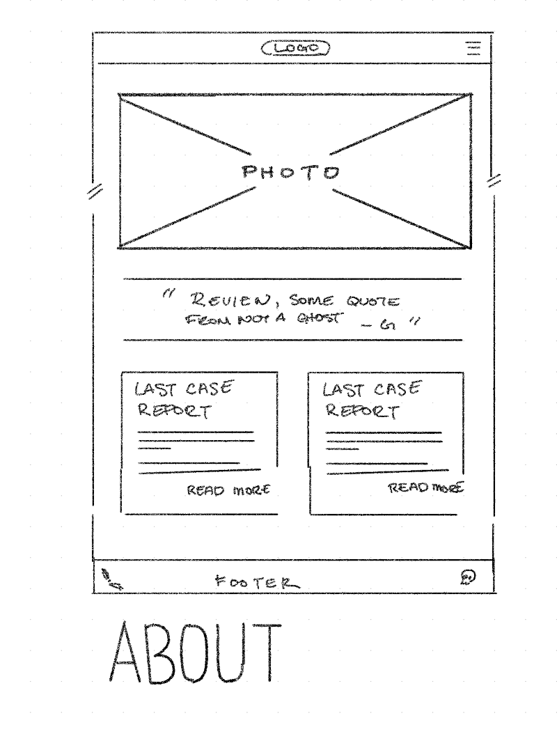
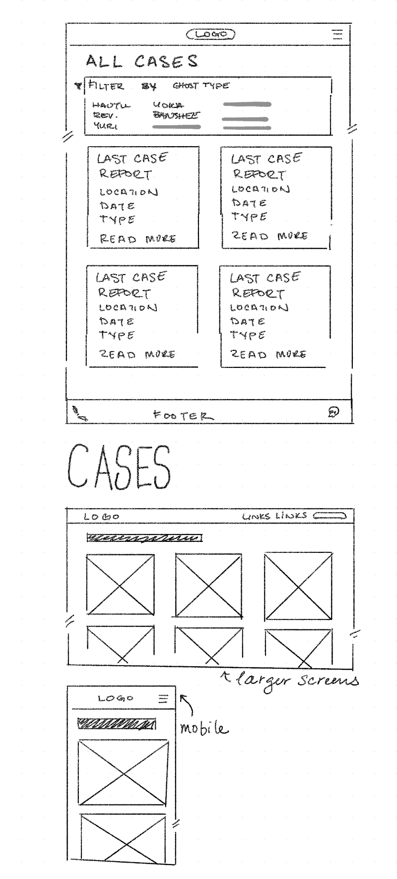
Site map (if useful), wireframes and mock-ups
Wireframes
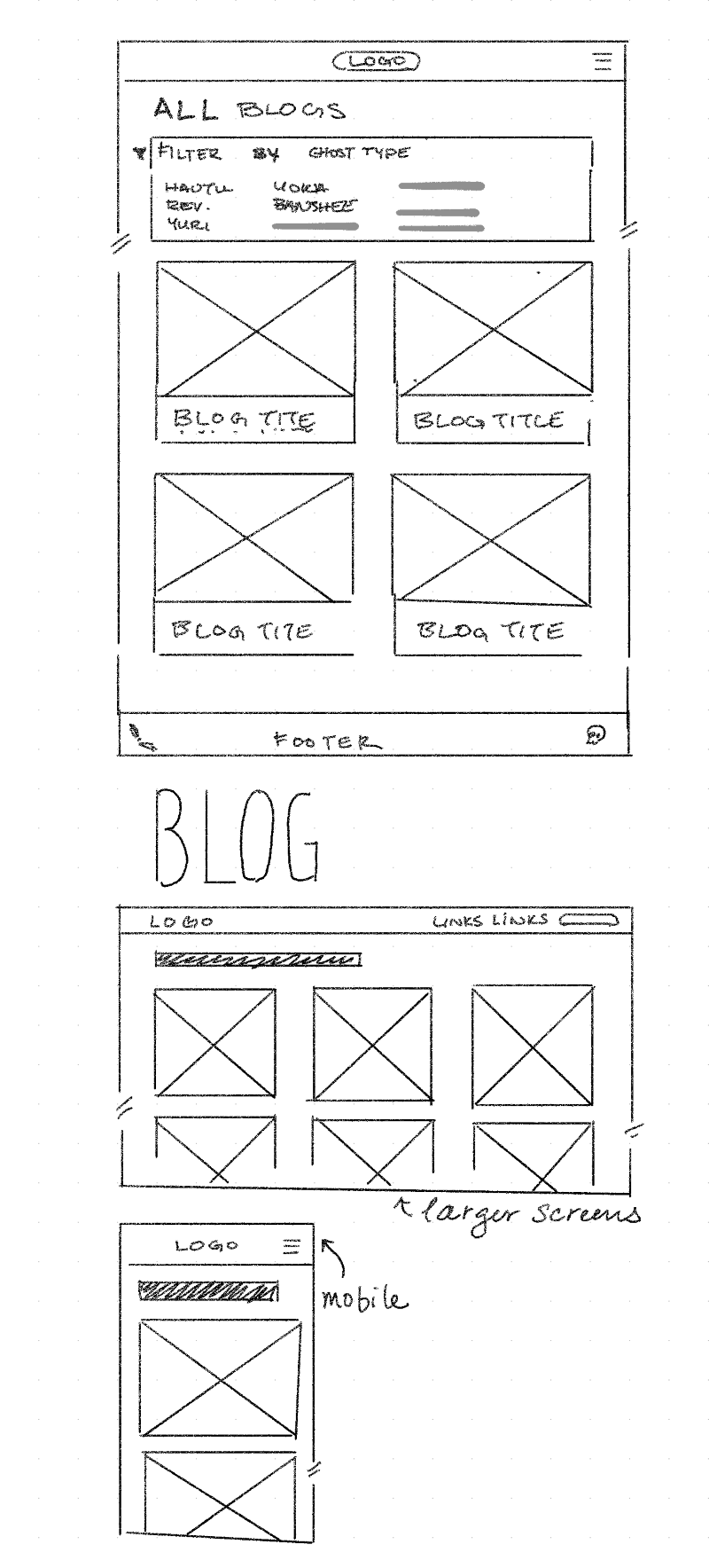
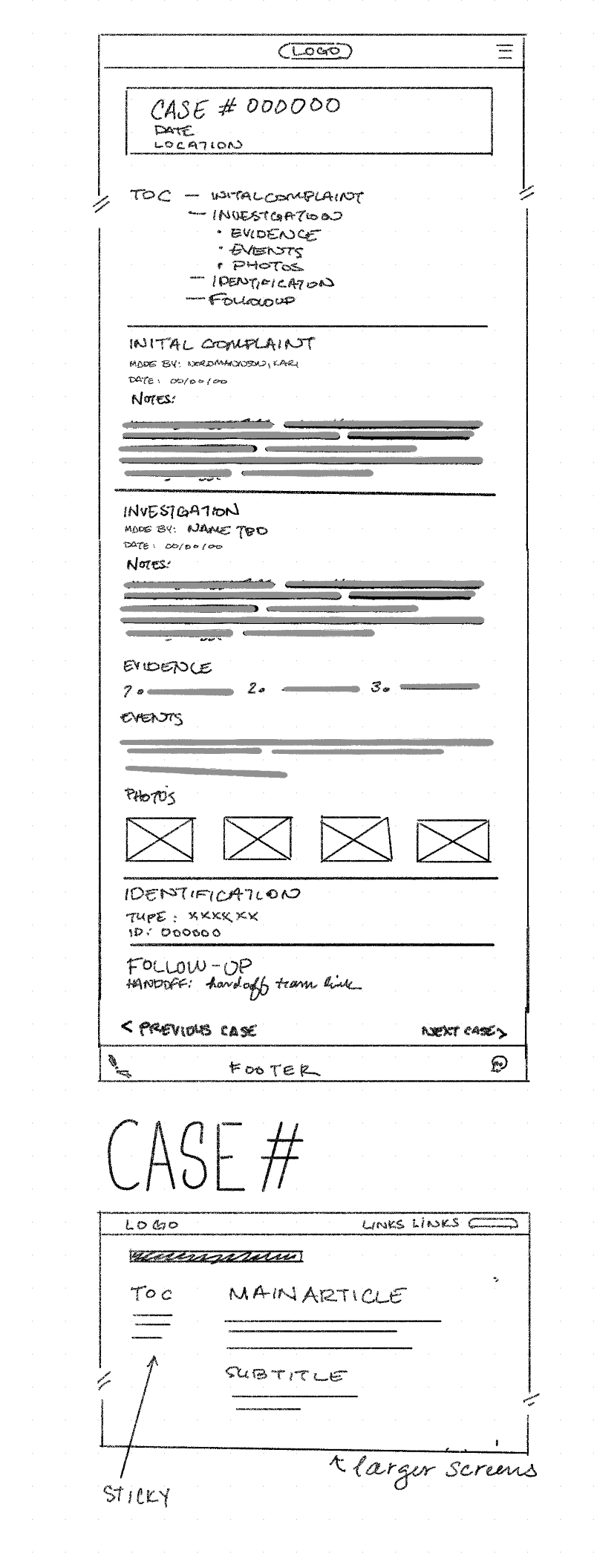
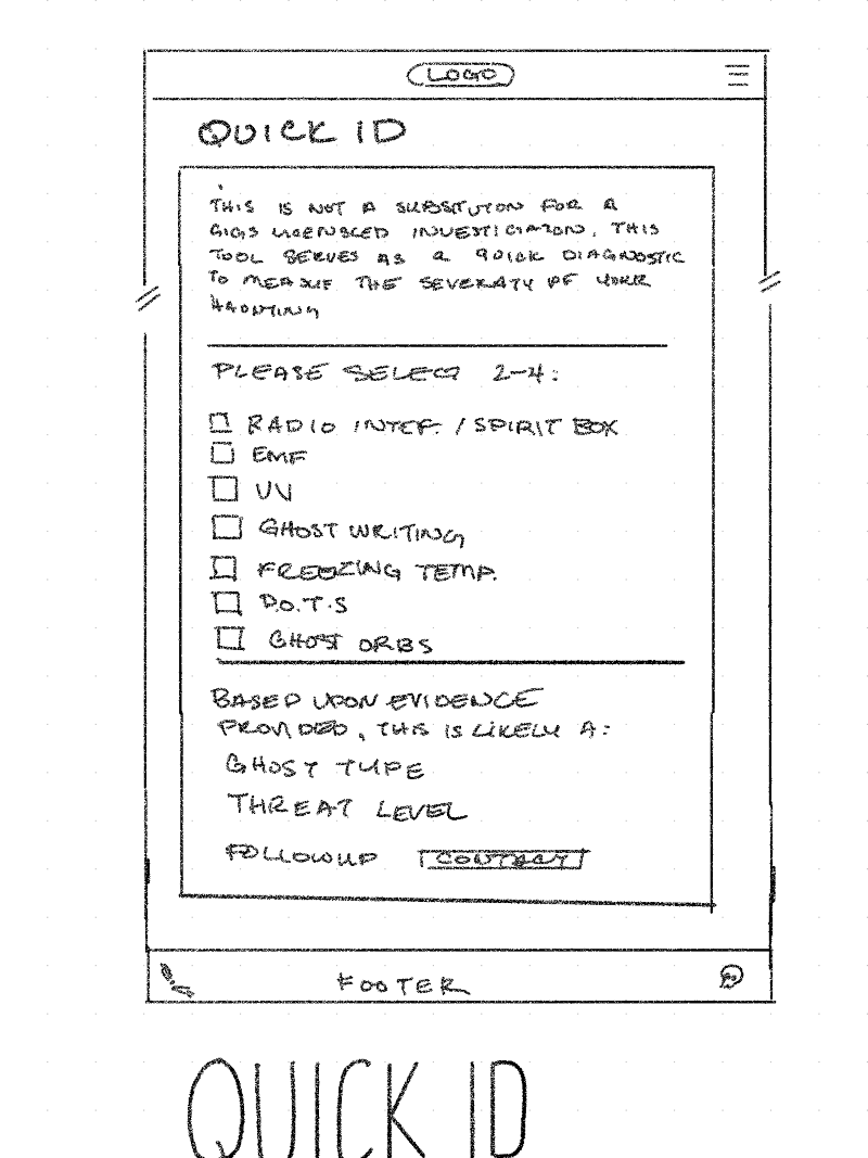
Other
Colour Palette